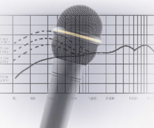
It is said that “a picture is worth a thousand words” and nowhere is this more applicable than when trying to teach complex concepts.
A graphical depiction can often convey an idea better, and quicker, than a whole bunch of words. This is because our brains are mainly image processors, not word processors; the part of our brain that processes words is actually very small in comparison to the part that processes visual information.
Therefore visual cues help us to better store and retrieve complex information.
Bearing this in mind I’ve been exploring various ways of representing key audio concepts and terminology visually. This invariably involves a certain degree of simplification but I think the results are a useful weapon in the battle against incomprehension.

On the left is a representation of a kick drum that has been miked in a standard way, with a single microphone poking through the hole in the front skin.
Here we can see there is slightly more energy in the bottom and top of the sound (i.e., the thud and the click) than there is in the middle – quite common when close miking a kick drum.
The right side of the image represents the same signal after a little EQ has been applied, in this instance the bottom end has been enhanced while the lower and upper mid range frequencies have been reduced slightly to give that classic kick drum sound.
EQ isn’t the only way we affect the frequency content of sounds so let’s take a look at some other methods (Figure 2).

Now that we’ve established a simple way to visually represent the different sounds, and the ways in which we can affect them, let’s take a look at a full drum kit. The kit as a whole has the widest frequency range of just about any instrument (with the possible exception of the pipe organ), from the low thud of the kick drum to the fizzy sparkle of the cymbals.


